18. Navigation drawer
A navigation drawer is a panel that usually displays navigation options on the left edge of the screen, as shown on the right side of the figure below. It is hidden most of the time, but is revealed when the user swipes a finger from the left edge of the screen or touches the navigation icon in the app bar, as shown on the left side of the figure below.
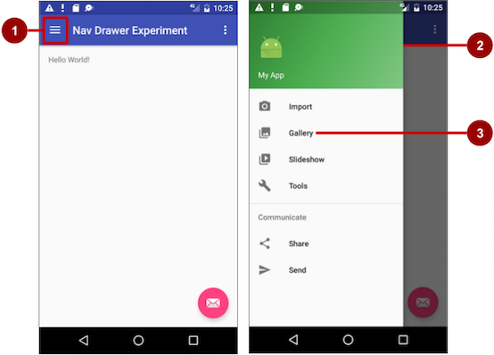
In the figure above:
- Navigation icon in the app bar
- Navigation drawer
- Navigation drawer menu item
A good example of a navigation drawer is in the Gmail app, which provides access to the inbox, labeled email folders, and settings. The best practice for employing a navigation drawer is to provide descendant navigation from the parent Activity to all of the other child screens in an app. It can display many navigation targets at once—for example, it can contain buttons (like a dashboard), tabs, or a list of items (like the Gmail drawer).
To make a navigation drawer in your app, you need to create the following layouts:
- A navigation drawer as the Activity layout root ViewGroup
- A navigation View for the drawer itself
- An app bar layout that includes room for a navigation icon button
- A content layout for the Activity that displays the navigation drawer
- A layout for the navigation drawer header
Follow these general steps:
- Populate the navigation drawer menu with item titles and icons.
- Set up the navigation drawer and item listeners in the Activity code.
- Handle the navigation menu item selections.
Adding Dependency:
implementation 'com.google.android.material:material:1.1.0'
18.2. activity_main.xml
<?xml version="1.0" encoding="utf-8"?>
<androidx.drawerlayout.widget.DrawerLayout xmlns:android="http://schemas.android.com/apk/res/android"
    xmlns:app="http://schemas.android.com/apk/res-auto"
    xmlns:tools="http://schemas.android.com/tools"
    android:id="@+id/drawerlayout"
    android:layout_width="match_parent"
    android:layout_height="match_parent"
    tools:context=".MainActivity">

    <include
        layout="@layout/content_main"
        android:layout_width="match_parent"
        android:layout_height="match_parent" />

    <com.google.android.material.navigation.NavigationView
        android:id="@+id/navigation_view"
        android:layout_width="wrap_content"
        android:layout_height="match_parent"
        android:layout_gravity="start"
        android:fitsSystemWindows="true"
        app:headerLayout="@layout/nav_header"
        app:itemIconTint="#3F51B5"
        app:menu="@menu/menu" />

</androidx.drawerlayout.widget.DrawerLayout>
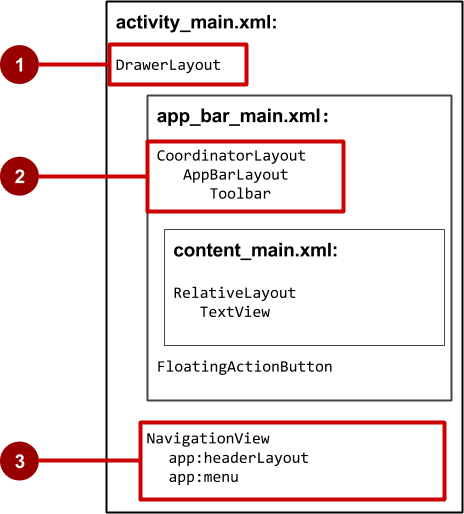
In the figure above:
- DrawerLayout is the root ViewGroup of the Activity layout.
- The included content_main.xml uses a CoordinatorLayout as its root, and defines the app bar layout with a Toolbar which will include the navigation icon to open the drawer.
- The NavigationView defines the navigation drawer layout and its header, and adds menu items to it.
Note the following in the activity_main.xml layout:
- The android:id for the DrawerLayout is -drawer_layout_. You will use this id to instantiate a drawer object in your code.
- The android:id for the NavigationView is nav_view. You will use this id to instantiate a navigationView object in your code.
- The NavigationView must specify its horizontal gravity with the android:layout_gravity attribute. Use the “start” value for this attribute (rather than “left”), so that if the app is used with right-to-left (RTF) languages, the drawer appears on the right rather than the left side.
android:layout_gravity="start"
- Use the android:fitsSystemWindows=”true” attribute to set the padding of the DrawerLayout and the NavigationView to ensure the contents don’t overlay the system windows. DrawerLayout uses fitsSystemWindows as a sign that it needs to inset its children (such as the main content ViewGroup), but still draw the top status bar background in that space. As a result, the navigation drawer appears to be overlapping, but not obscuring, the translucent top status bar. The insets you get from fitsSystemWindows will be correct on all platform versions to ensure that your content does not overlap with system-provided UI components.
18.5. The app bar layout
The include tag in the activity_main.xml layout file includes the app_bar_main.xml layout file, which uses a CoordinatorLayout as its root. The app_bar_main.xml file defines the app bar layout with the Toolbar class as shown previously in the chapter about menus and pickers. It also defines a floating action button, and uses an include tag to include the content_main.xml layout.
The following is the code for the content_main.xml file:
18.6. content_main.xml
<?xml version="1.0" encoding="utf-8"?>
<LinearLayout xmlns:android="http://schemas.android.com/apk/res/android"
    android:layout_width="match_parent"
    android:layout_height="match_parent"
    android:orientation="vertical"
    android:fitsSystemWindows="true">

    <com.google.android.material.appbar.AppBarLayout
        android:layout_width="match_parent"
        android:layout_height="wrap_content">

        <androidx.appcompat.widget.Toolbar
            android:id="@+id/tollbar"
            android:layout_width="match_parent"
            android:layout_height="wrap_content">

            <LinearLayout
                android:layout_width="match_parent"
                android:layout_height="wrap_content"
                android:orientation="vertical">

                <TextView
                    style="@style/TextAppearance.AppCompat.Title"
                    android:layout_width="match_parent"
                    android:layout_height="wrap_content"
                    android:fontFamily="serif"
                    android:gravity="center"
                    android:text="NAVIGATION 🥰"
                    android:textColor="#FFFFFF"
                    android:textStyle="bold" />

            </LinearLayout>

        </androidx.appcompat.widget.Toolbar>
    </com.google.android.material.appbar.AppBarLayout>

    <FrameLayout
        android:id="@+id/contentlayout"
        android:layout_width="match_parent"
        android:layout_height="match_parent">
    </FrameLayout>
</LinearLayout>
Note the following:
- The content_main.xml layout uses a CoordinatorLayout as its root.
- The content_main.xml layout uses the android:fitsSystemWindows=”true” attribute to set the padding of the app bar to ensure that it doesn’t overlay the system windows such as the status bar.
